Colors
Color is the visual element of your brand’s look & feel, but also vital component in how well your product works.
Working in harmony
Each hue requires an informed decision, but how they interact is key to accessible design.
Start with palattes
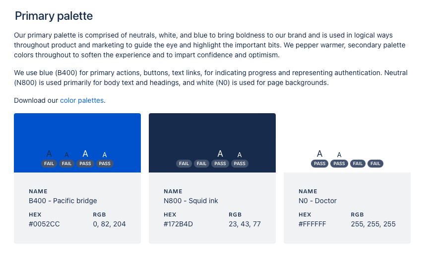
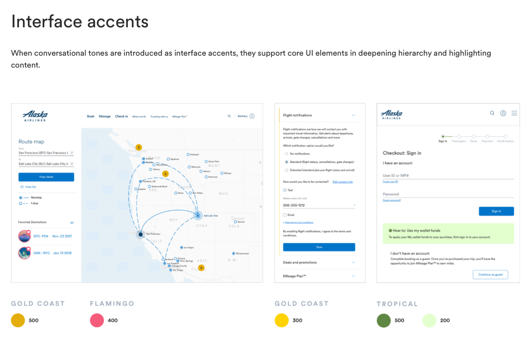
Palettes are groups of colors, based on context. You’ll want to make sure your Primary, Secondary, and System palettes all work in harmony with each other.


Define key properties
Certain aspects of color will have a bigger impact on functionality than others.
- Contrast: Federal guidelines regulate contrast requirements (WCAG). These ensure that sites don’t rely on color vision for successful usage.
- Saturation: This plays a big role in where the users’ eyes are directed, and where they aren’t.
- UX psychology: Some colors have established associations - both emotionally and functionally.
Additional considerations
- Start small. Palettes can grow quickly, so start small
- Focus on function. Everyone sees color differently, so make sure your palette works for your users first, then consider personal preferences.
- Anticipate confusion. Consider system colors, browser colors, and any other areas that might create confusion for a user.